
Modura is a new contemporary clothing brand looking to develop a web presence. They would like a brand refresh and an e commerce app where consumers can make purchases of clothing and accessory items.
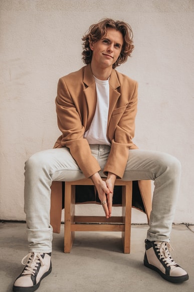
Modura is for trendy men and women between 18 and 25 years old. These individuals are early in their careers and are looking for an affordable solution for business casual clothing to wear to their jobs in urban areas. They are fashion-forward, and conscious of trends. They want to dress for the jobs they want without appearing overdressed. Dress for the job you want


While sketching logo concepts, I kept the brand name, market, and keywords in mind (trendy, fashion-forward, modern, affordable, etc.). I spent about 90 minutes with pen and paper. I sketched versions of the brand name as a wordmark, drew different versions of the brand name’s first letter for a monogram, and considered ideas for a standalone logo graphic or logomark.


Now that I had the Logo design set, next I created an icon set for the app. My goal here was to design icons that are visually simple, easy to understand and remember, and complement the style of the logo while embodying the modern Modura brand. I designed the icons using the shape, pen, and Boolean tools in Figma.
After creating the icon set, I created a style tile to communicate the design decisions including logo, icons, colors, buttons, photography, and typefaces.
I chose Orange as the primary brand color for Modura. Orange often symbolizes happiness, friendliness, and most importantly, affordability, which is a theme for the Modura user. I decided to use a light gray for the secondary color to help provide a neutral feel and appeal to both women, men, and all genders. The light gray will also help modernize the look and feel of the brand, as well as make that orange primary color pop nicely.
In terms of typography, I chose Nunito which is a popular sans serif type that communicates simplicity and straightforwardness.

Now that I had put the style tile together, I used it as a guide for the creation of 3 sample screens for the Modura app. After some pen and paper sketches, I digitized the following screens:

This project taught me how important ideation is when creating a brand's look and feel. Throughout the creative process, I practiced generating, developing, and communicating concepts and ideas. Through sketching, logo design concepts, iconography, color palette, typography, I was able to see how these design elements come together. I also learned how subtle changes can really impact the overall mood of a brand. For next steps, I will design additional screens such as the checkout, shopping bag, and liked/saved items pages.